Monday, July 14, 2008

it's about that time!

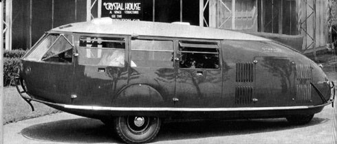
image courtesy of www.ndesign-studio.com

The prep work for the final exhibition has been divided among the lucky charm groups.  Please do your part in making this night a success!

clovers : invitations + setup
diamonds : rentals  
moons : food + drinks
hearts : music + decorations
stars : clean-up

April and Michelle will lead a discussion at 9 am on Wednesday in 204 to go over the event's budget and other details.

Thursday, June 26, 2008

summer session II

Remember that on Monday you will be responsible for bringing Robert up to speed on your projects.  We will speak in more detail about our expectations for this review Monday morning.  

1:00 diamonds
1:30 hearts
2:00 stars
2:30 moons
3:00 clovers

-suzanne

Tuesday, June 24, 2008

connect the dots...


image from http://www.thisischris.com/feature/2002/peeweechristmas.html

a final (brief) missive as i part company with you at the end of the first term. remember that you have created many great design opportunities for your projects...materials, light, color, formal investigations, writing....now is the time to seamlessly weave together all of what you've done as you make a dash to the end of the second term. recalling that brilliant technology interface represented on "pee wee's playhouse"....use the magic screen in good health.

i wish you every success...
--patrick

Wednesday, June 18, 2008

thinking + linking


10(1)


10(2)


10(3)


10(4)

still shots of the famous opening sequence to the "powers of 10,"
a film by ray + charles eames (1968, 1977) that explores the variety
of scales we address as designers in our work.
images courtesy of http://powersof10.com, also an interesting website to explore.


one of the greatest things i enjoy about being a designer is thinking greater than my own projects and interpretations...and linking beyond to the whole course of humanity. that awesome responsibility calls for us all to be engaged citizens of the world and to strive to understand the human condition at many scales. for our work, we mostly concern ourselves with the most immediate environment, the interior, as it shapes human experience and as our foibles, hopes, dreams, and aspirations in turn shape the world around. as you move from schematics into design development, keep the humanity in your projects and remember that a key aspect to being a designer involves thinking out loud in physical form by linking to the fundamental need for human beings to find comfort, mystery, and joy in the places in which we live, work, and celebrate.
don't forget your own design philosophies + manifestos as you make this critical shift toward design development. in your projects we should see your efforts as designers to fully articulate your vision for a better world. see the powers of 10 website.

Tuesday, June 17, 2008

this post goes out to the shooting stars

Check out designer Soojin Hyun's new take on the "home office" via the designboom blog. While you're there, be sure to look around. So much inspiration, so little time!
-suzanne

Tuesday, June 10, 2008

quotable quotes + images

we've pulled together some words on design by a variety of folk as a source of inspiration for the week. some of the people quoted may surprise you....and their words may help you to think about your concerns as an environmental designer in touch with the world. we would encourage you to think deeply about the impact of your design interventions, both for this study and later in your practice as a designer.


design within a web...

“Good design is a Renaissance attitude that combines technology, cognitive science, human need and beauty to produce something.”

--Paola Antonelli, Museum of Modern Art


on beauty...
"When I am working on a problem I never think about beauty. I only think about how to solve the problem. But when I have finished, if the solution is not beautiful, I know it is wrong.”
--Buckminster Fuller


design has social purpose...
"Design is creation in or alteration of the world to meet the needs and desires of people.”

--Dirk Knemeyer, Thread Inc.


the deep meaning of design...
“In most people’s vocabularies, design means veneer. It’s interior decorating. It’s the fabric of the curtains and sofa. But to me, nothing could be further from the meaning of design. Design is the fundamental soul of a man-made creation that ends up expressing itself in successive outer layers of the product or service.”

--Steve Jobs, Apple Computer


http://www.fredmiranda.com/hosting/showphoto.php?photo=25213&sort=1&size=medium&cat=500
design has many outward impacts...
“If I’m going to talk about design, that purely arbitrary and immensely human construct, I should say that by design I mean the process both physical and mental by which people give an order to objects, community, environments and behavior.”
--Bill Stumpf


http://www.softpedia.com/progScreenshots/Karaoke-Song-List-Creator-Screenshot-28087.html
a musical metaphor...

“The designer leads a kind of karaoke existence, always singing someone else's song, and never saying what he thinks should be said.”
--Bruce Mau


when you're feeling stuck...
"Design depends largely on constraints.”

--Charles Eames


http://www.graffiti.org/eyegasm/htm/f/font-font01.htm
something funny...AND perhaps useful...
“A designer should only use these 5 typefaces: Bodoni, Helvetica, Times Roman, Century, Futura.”

--Massimo Vignelli


http://www.fredmiranda.com/hosting/showphoto.php?photo=18098&sort=1&cat=3903&page=1
design brings together many opportunities...

“No design can exist in isolation. It is always related, sometimes in very complex ways, to an entire constellation of influencing situations and attitudes. What we call a good design is one which achieves integrity – that is, unity or wholeness – in balanced relation to its environment. The reason good design is hard to come by is that its creation demands a high degree of emotional and intellectual maturity in the designer, and such people are not found too often.”
--George Nelson


http://www.peterschnitzler.com/pages/Language_1.htm
on style...
“Good design at least part of the time, includes the criteria of being direct in relation to the problem at hand – not obscure, trendy, or stylish. A new language, visual or verbal, must be couched in a language that is already understood.”

--Ivan Chermayeff


and order...
“Design is the conscious effort to impose a meaningful order.”
--Victor Papanek

Friday, June 6, 2008

stunning luminosity


As we developed "juicy" adjectives on Wednesday to describe light, I was reminded of an incredible exhibit I experienced a few years ago at the Tate Modern. The Weather Project, by Olafur Eliasson, sucked museum visitors "into the light" immediately upon entering the space's vast lobby. As described on Tate Modern's website, the artist used mono-frequency lamps, most often used as street lamps, that "emit light at such a narrow frequency that colors other than yellow and black are invisible, thus transforming the visual field around the sun into a vast duotone landscape." To use a few adjectives, the resulting experience was intense, psychedelic, bizarre, ethereal and blissful, all at the same time.

Click here to see additional images of Olafur Eliasson's work with light.
Care to know even more? Check out this great read.

-suzanne

Wednesday, May 28, 2008

getting color [in the bag]


While we did not have time to fully address color in yesterday's pin-up, Patrick and I hope you will continue to explore it within your schematic development this week. This can be a difficult layer of detail to specify and, as I'm sure we can all attest to, when left to the end of a project, and a limited selection of markers, the results can be disastrous (i.e. a "giant easter egg of a room" or a "clown explosion" to quote other studio instructors).

I find when choosing a color pallete it helps to begin with an image that evokes a feeling you are trying to portray within your project. Are the colors in the image cool? warm? complimentary? analogous? By studying the image closely, you can begin to better understand what type of colors you are ultimately seeking.

Recently, I found this online tool which can help with the process. As you can see, the tool helps generate a pallete based on any image that inspires (in this case your classmates' bags). While I caution using EVERY color it identifies (which might put you in jeopardy of the "clown explosion" scenerio), I encourage you to give it a try and see what happens.

-suzanne

Monday, May 26, 2008

patrick’s [manifesto]

telling design stories
when a person dies, a valuable library burns to the ground. – ancient African proverb

I am a civic-minded, hard working storyteller
who seeks connections beyond the expected. I believe in serendipity, in fair exchange, and in sharing. I value excellence in communication, engagement in the local, links to the global, and the passion of others.

I build social capital to forge bonds with unlikely partners
to bring design to the world with greater results than I ever could imagine doing by myself. I act with integrity and sincerity, respecting each human being and the experiences and stories they bring.

Through my work, I hope to leave the world a better place.

I have come to appreciate the benefits of a well-crafted charrette and the time-honored practice of designing and building. My life became easier after I selected Arial as a font of choice. I like square brackets.

I thrive in an environment that is intellectually and physically stimulating.
I am awed by simple beauty and eloquent words. I like seeing the inter-connected world in my work and that of others. I realize that good food, great music, and kind deeds are definitely part of the equation.

My tools for my design journey include…
…the wonders of the stars,
…the detailed layering of information on a map,
…a passion for learning and life,
…a compass that sometimes reads my heart
and other times reads my head,
…a good dictionary [with etymology],
…and a journal.

I look forward to growing as journeys, storytelling, and conversations continue.

cheers,
--patrick

Thursday, May 22, 2008

a philosophy of action

"To live within limits. To want one thing. Or a few things very much and love them dearly. Cling to them, survey them from every angle. Become one with them--that is what makes the poet, the artist, the human being." -Johann Goethe
As a designer and teacher I commit to:
seeking inspiration in the everyday
engaging local and global design communities
embracing process
drawing : in my sketchbook and from my surroundings
working beyond the boundaries of my comfort zone
living simply and designing sustainably
focusing on learning : learning to focus
listening more, talking less
fostering collaboration in and out of the classroom
sharing lessons I have learned
enjoying the beauty life has to offer

-suzanne

transparency : a good place to begin


yesterday in class, suzanne and i remarked on some common themes or through-threads in your esquisse presentations. we saw that many of you captured a sense of inquiry about transparency in your work…and it’s interesting to think of that idea on several levels: [1] physical transparency in the materials you will investigate (as early as next week!) in your projects; [2] spatial transparency as you work to make your buildings legible to their inhabitants; and [3] organizational transparency, which we take to mean good communication through and about your work as we continue forward from our starting point.

trans·par·en·cy 
from the late sixteenth century with roots in medieval latin
root word [trans·par·ent]
transparere “shine through” parere "appear"

we liked both of these definitions…
easily seen through : allowing light to pass through with little or no interruption or distortion so that objects on the other side can be clearly seen
obvious and easy to recognize : clearly recognizable

...remembering, of course, that transparent + translucent are two different, but related, descriptors for materials

trans·lu·cent
letting light through diffusely : allowing light to pass through, but only diffusely, so that objects on the other side cannot be clearly distinguished

this caused us to think about the idea of clarity in what we do and represent….a theme to which we will return time and again during the course of the semester.

you’re not the only students with an interest in transparency. karen koehler + thom long (hampshire college), led a class to examine the idea of transparency in architecture. at the end of the course, students compiled an architectural journal
[0242/january08] to investigate through words and images about this strong imprint on architecture through time.  we heartily recommend you have a look at this beautifully designed site, replete with information.

cheers,  
--patrick